MEDIC is a mobile application that provides our users with the tool to find nearby medical clinics and a patient history feature that allows them to input their medical history and see upcoming appointments.
Course
Senior Interface Design
Duration
6 weeks (Spring 2018)
My Roles
User Experience, User Research/Testing, Prototyping, Interface Design, User Interaction

Project Context
We were to research a domain to find a problem we can potentially design for. We saw an opportunity to design for healthcare because it is an industry that can potentially affect everyone, and there is little innovation and intervention right now.
Sector Problem
High proportion of patients may go to the local emergency department because they do not have a family doctor or cannot get a timely medical appointment.
Target Audience
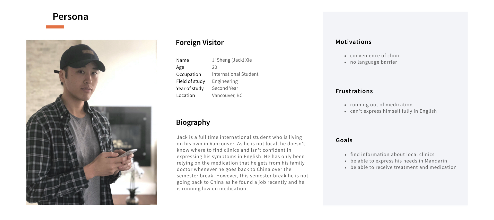
Through our initial user research, we were able to identified that foreign visitors are at the most disadvantaged when seeking medical help because they are not familiar with the area, and don't know where to turn to for help.
Insights
- Lack of transparency in the cost of healthcare.
“Patients and consumers are now especially disadvantaged when it comes to the lack of transparency around the price and cost of healthcare products and services.” – NCBI, 2010
- 100% of physicians we interviewed said having a shared medical record can help speed up the prescription of medications and knowledge of allergies.
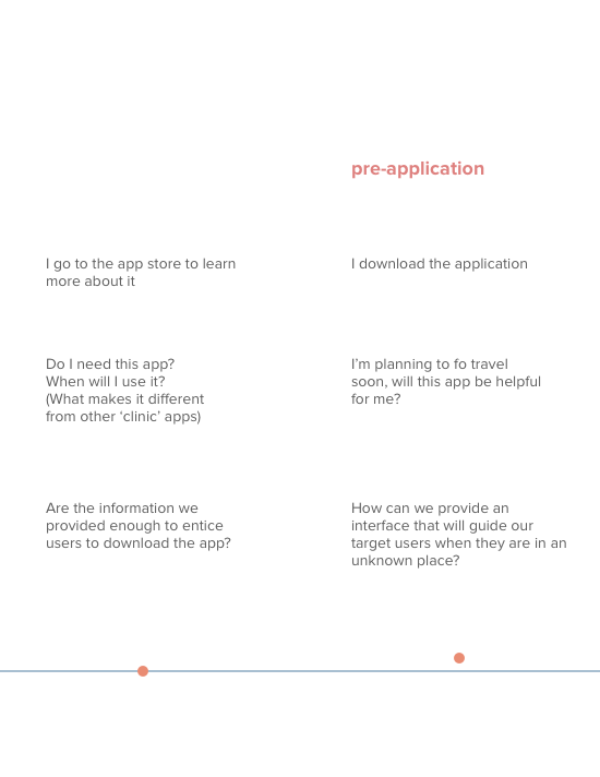
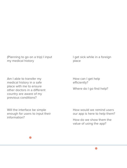
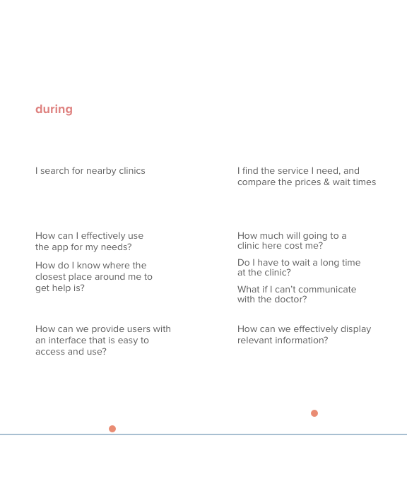
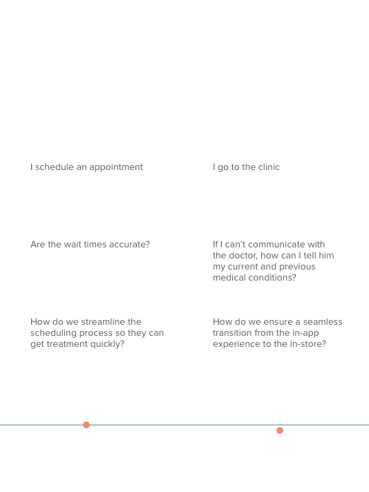
User Journey
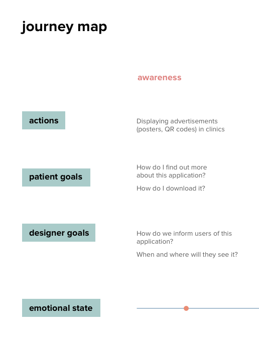
After mapping out our user journey, we found an opportunity to intervene early to elleviate the friction of finding medical care during crucial times. Users would still be able to contact their health care providers for their medical history.
This provided a foundation for us to start ideating and prioritizing our features.
Sketches
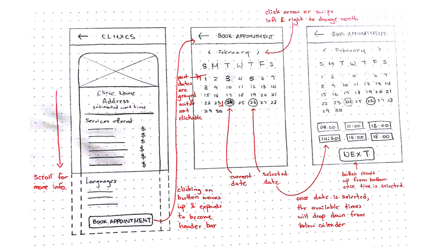
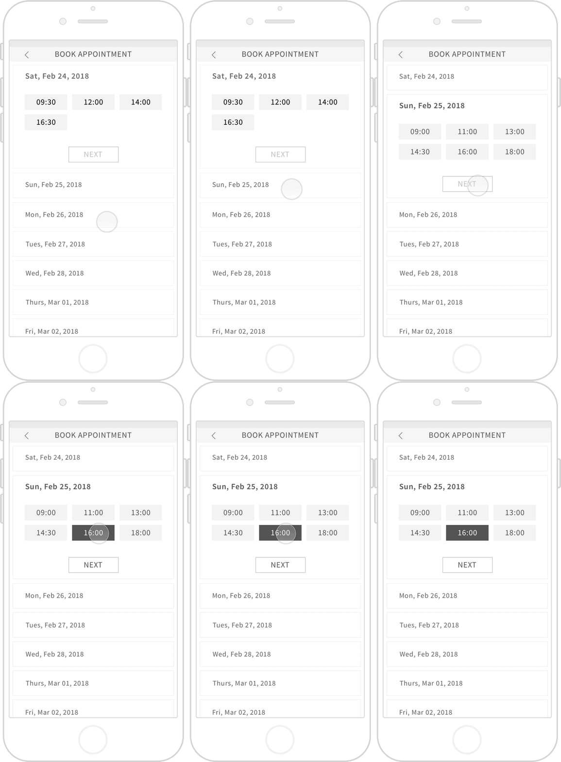
I did some explorations for the experience of scheduling an appointment.
The classic calender view was intuitive, but too overwhelming.
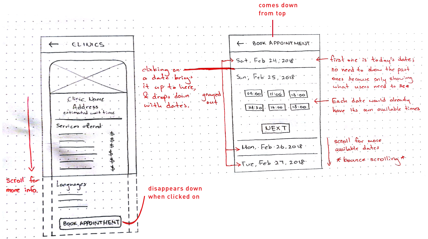
To present only the relevant information to the users, only the available dates and times are shown. Scroll vertically to see available dates.
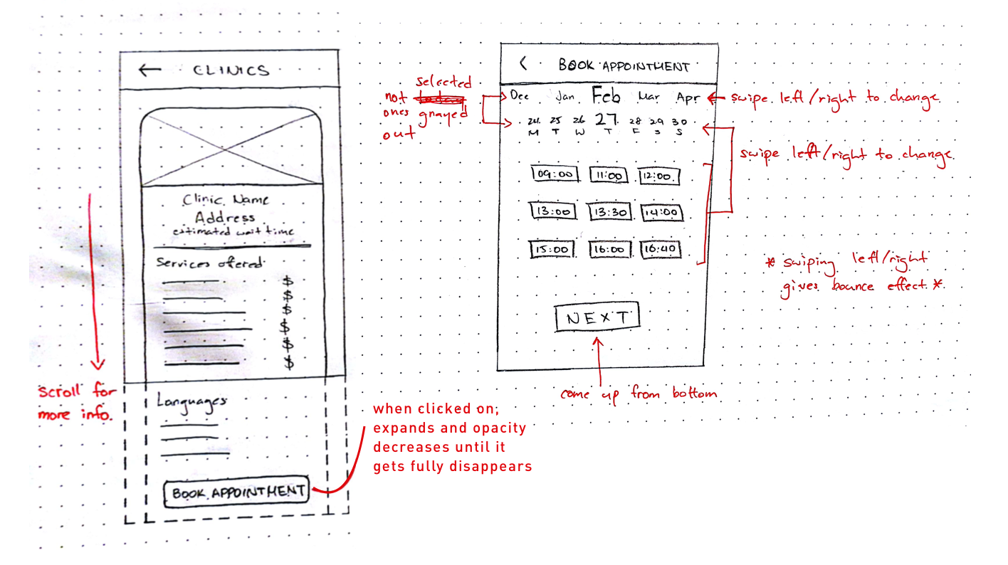
Scroll horizontally to see available dates.
Wireframes
Efficiency of use
We decided to move forward with the vertical layout because it allows for better scannability with room for bigger font sizes.
Final
Onboarding
First time users are greeted with an introduction of the purpose of the application, and a walk through of how they can get the most out of it.
Clinic Search
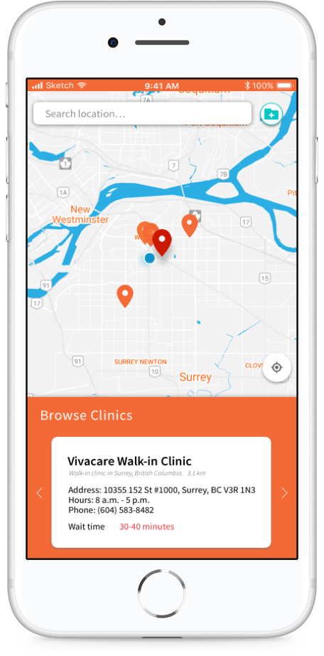
To make it as accessible as possible, clinics can be found through 3 different ways.
Search bar — Type location in the search bar to search around it.
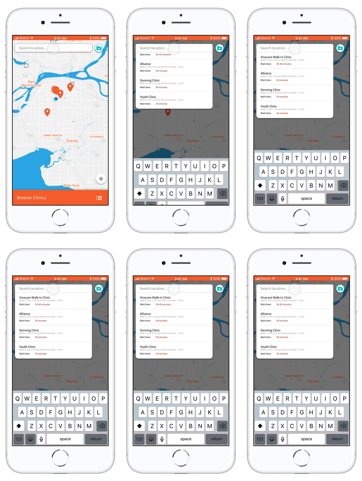
Pinpoint — Click on pin points for clinic information.

List — Browse through list of clinics around them based on distance.

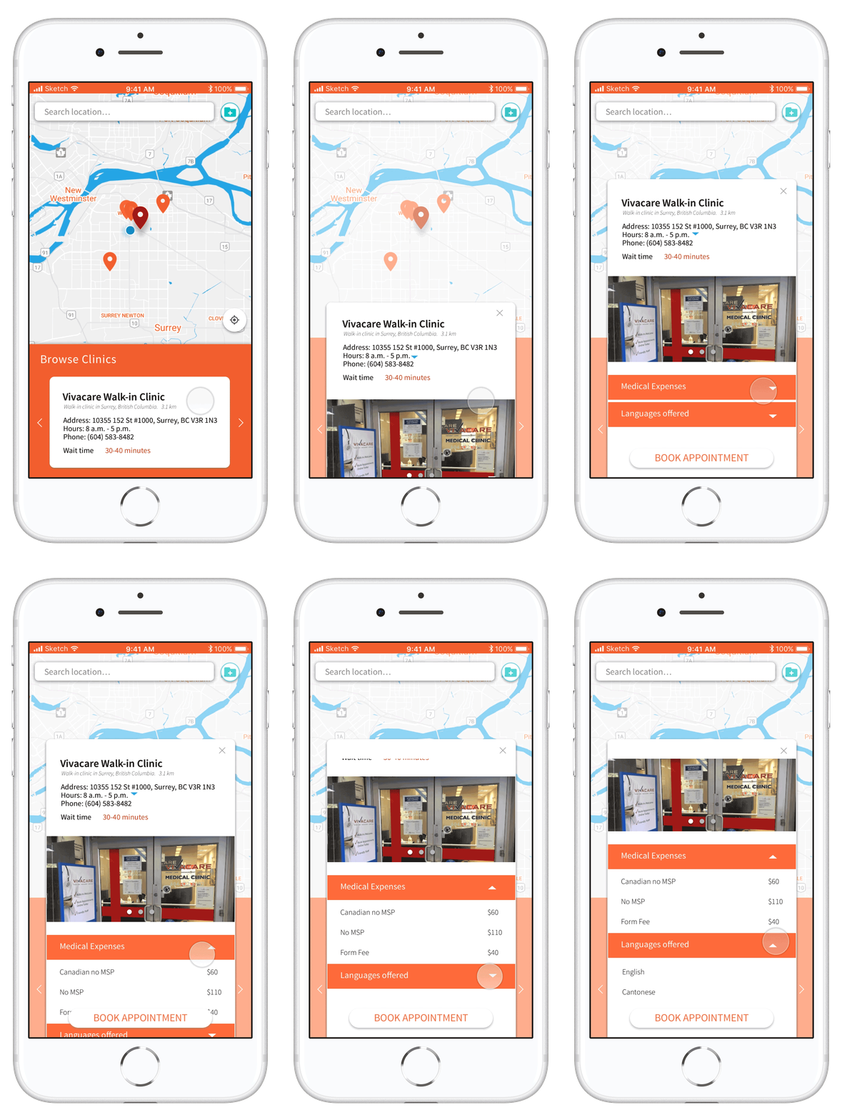
Clinic Information
Users can browse through each clinic's offered services to see if they fit their needs.
Booking Appointments
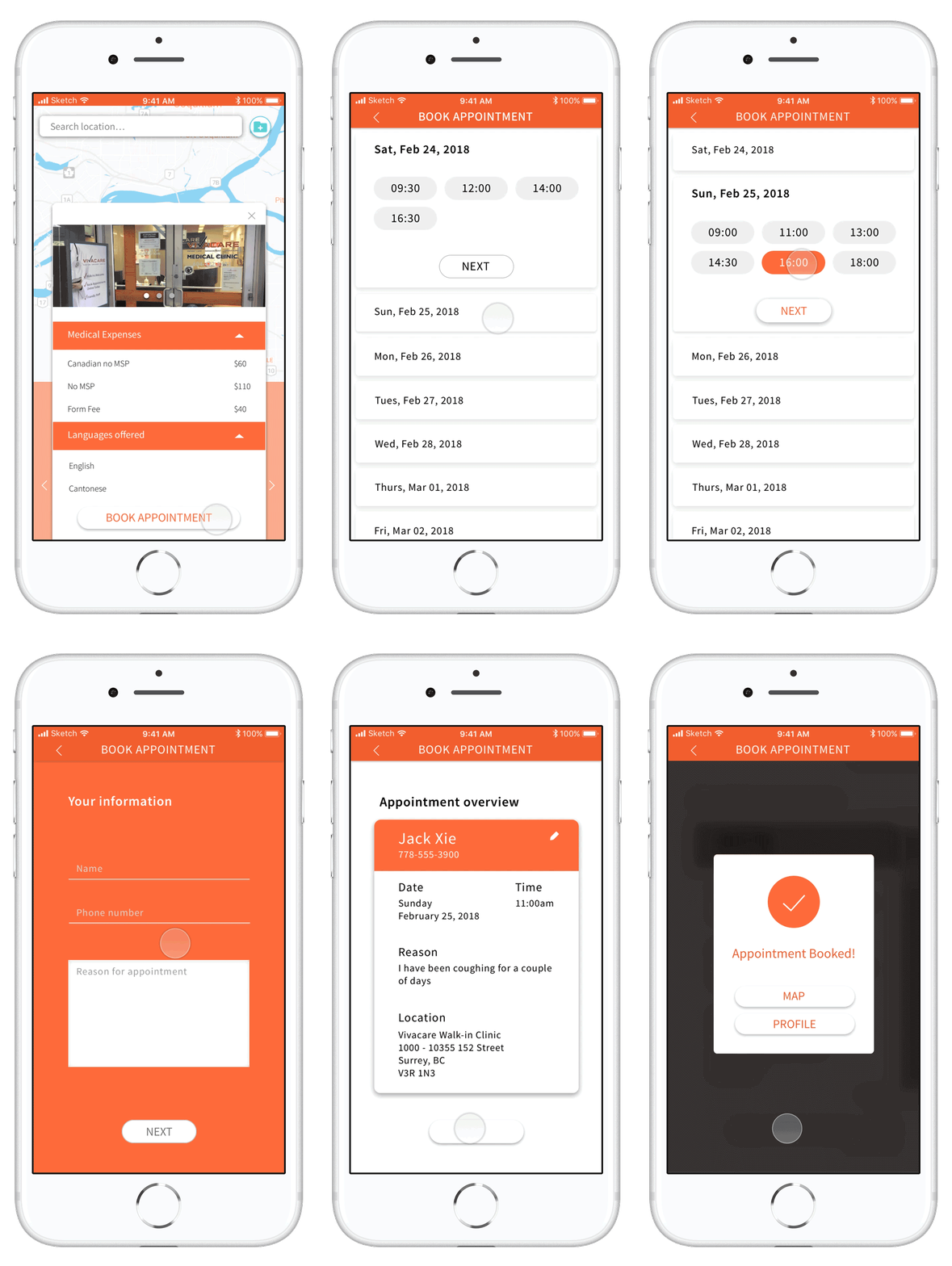
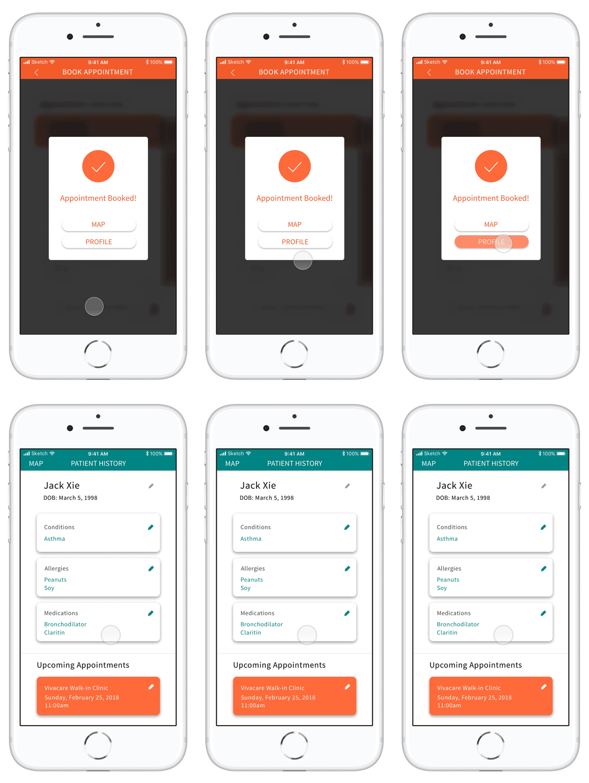
When booking, they can choose the available dates and times, fill out their information, and confirm the details prior to finalizing the booking.
Onlyavailable dates and times are shown to prevent errors from happening.
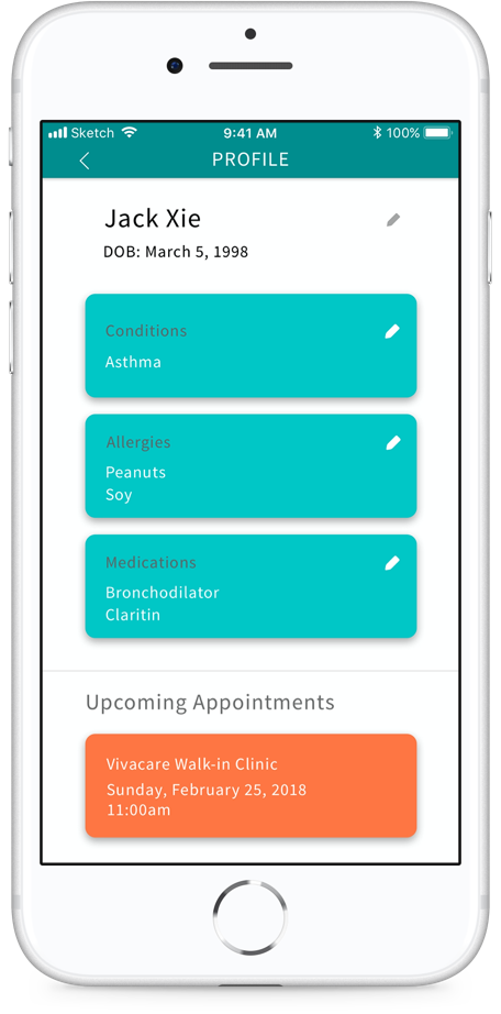
Patient History
Since we are targetting travellers, we have created a section to record their ongoing medical concerns and allergies, for easy access during in-office visits.
Refelction
Through researching this domain, I had a better understanding and we were able to scope the problem down to create a feasible solution. This project taught me the importance of gathering all the actors and gaining everyone's point of view. Our intention with Medic was to provide users with options other than the ER. While doing so, we were aware to not involve elements that we don't fully understand yet. Instead, we used empathetic research and motivational design to encourage users to seek medical help at clinics for less severe cases.
We tested our application on some designers because they were around when we were testing. However, we learned to try to test on our intended users as much as possible because the feedback the designers tend to give were more evolved around the design.
If we had more time, the next steps would be to explore where, when, and how users would be able to discover our application. Some thoughts are to display brochures and posters at local clinics so users are pre-exposed to the application prior to if they were to take a trip in the future.
