MONTBLANC DIGITAL PAPER
Over two years, we helped Montblanc set out on an ambitious journey to bring the traditional feel of handwriting into the digital world with their new e-ink tablet.
We worked closely with Montblanc to shape the vision, define the digital identity, build the design system, and craft the user experience.
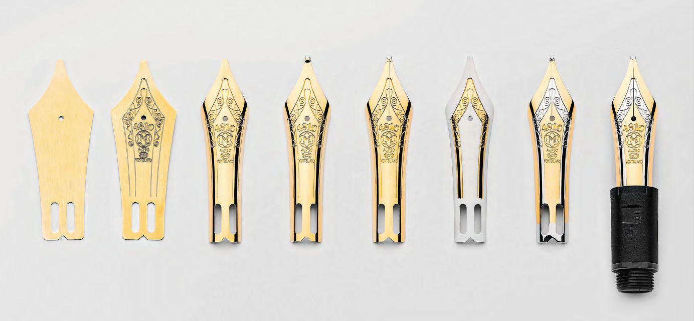
Digital Paper captures the feel of pen on paper, with writing options that give weightiness to every stroke and haptics that mimic the flow of ink.
- Branding
- Logo
- Typography
- UX Research & Strategy
- Interaction Design
- 2023
Immersion in the brand
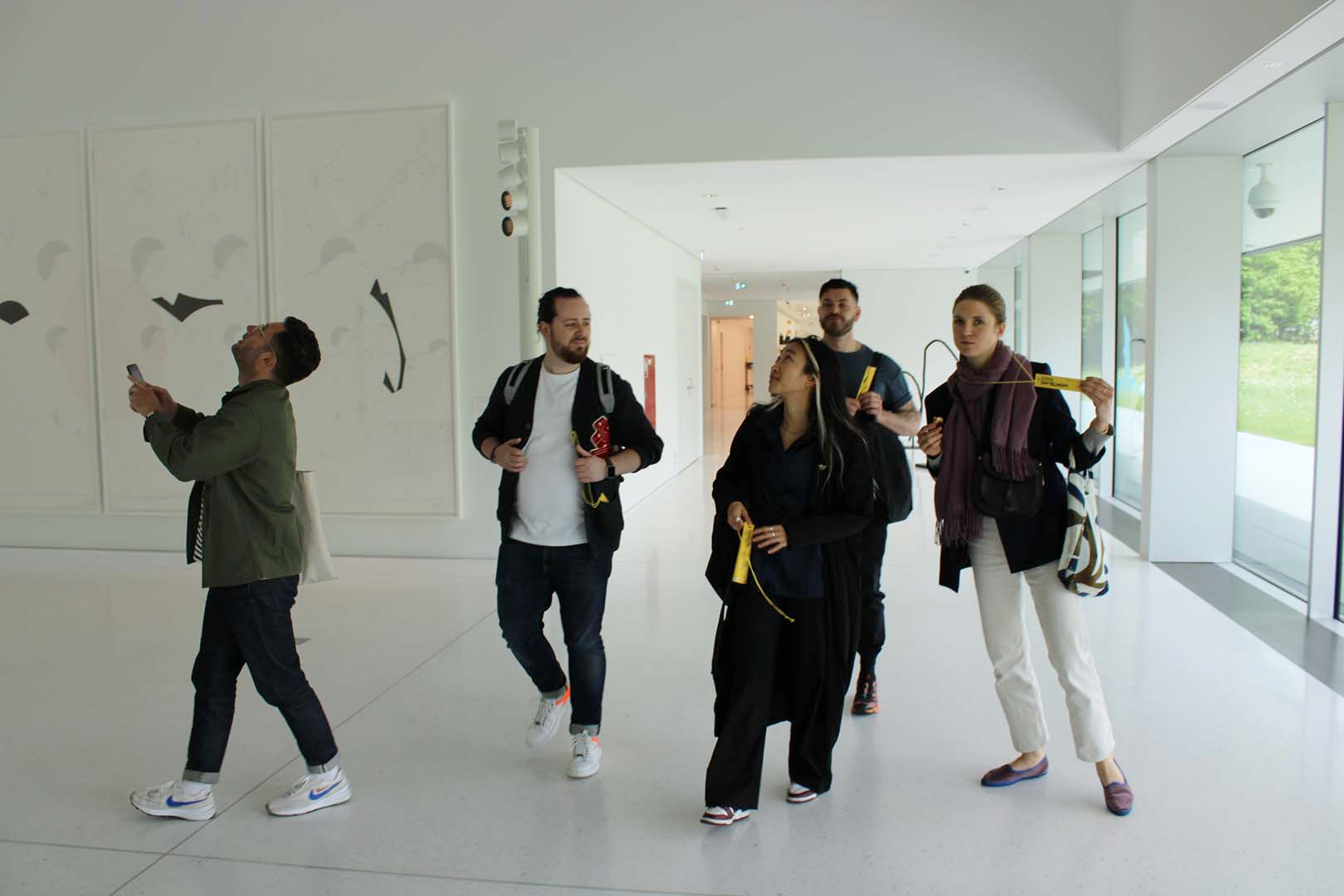
To kick off the project, we spent a week with the Montblanc team in Hamburg. We explored the brand's rich history, took a peek into the archives, and played around with early device prototypes.
This immersion helped us further understand Montblanc's values, craft, and ambitions for their new writing device.
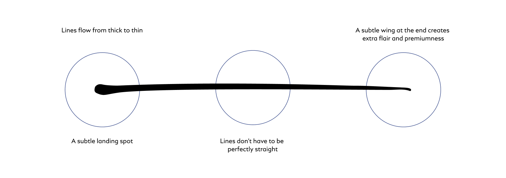
Grounded in The Beauty of Handwriting
Our goal was to bring the feel of ink on paper into an e-ink environment, keeping the natural imperfections, pressure, and personal expression that makes handwriting feel uniquely human.
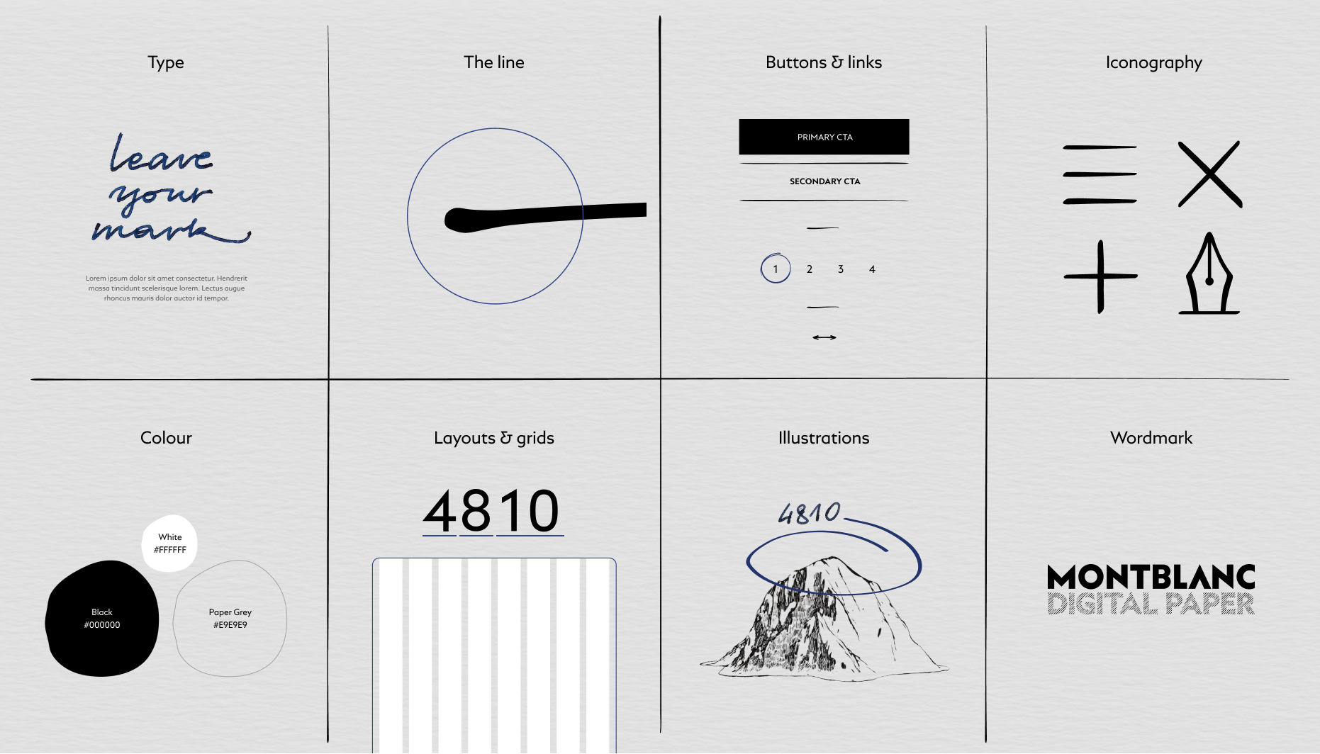
We built out eight key brand elements to reflect the soul, timelessness and simplicity we wanted the tablet to have.
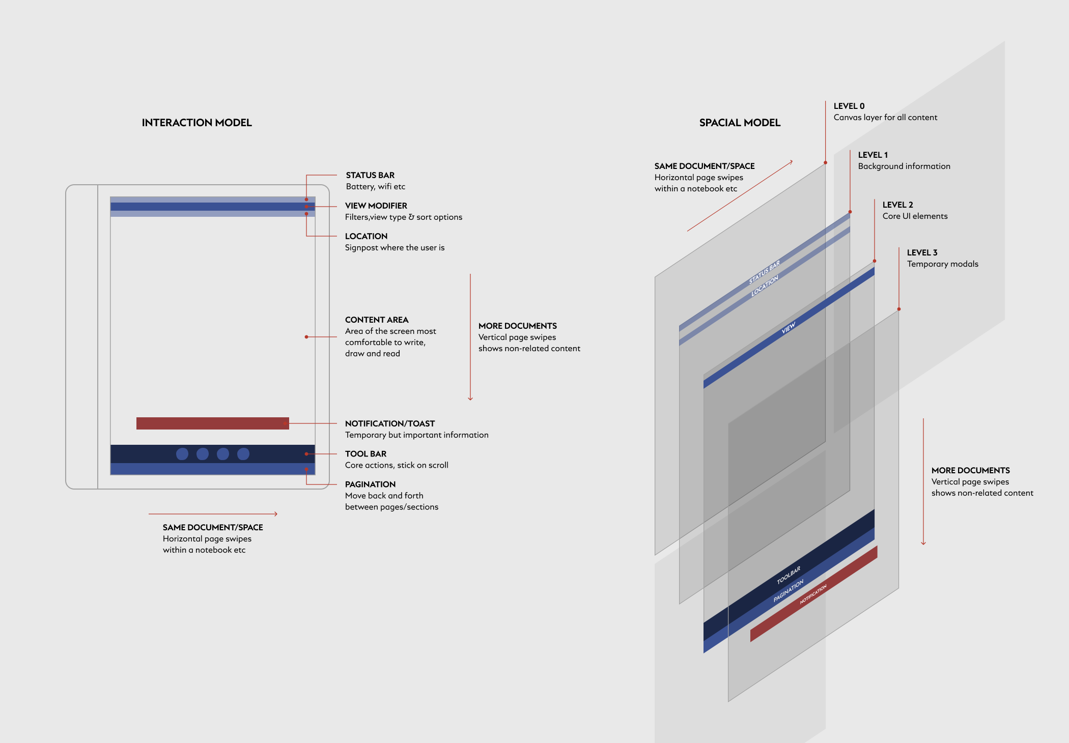
Building an interaction model
We designed an interaction model to help us create a logical system of interaction logic that feels effortless and intuitive.
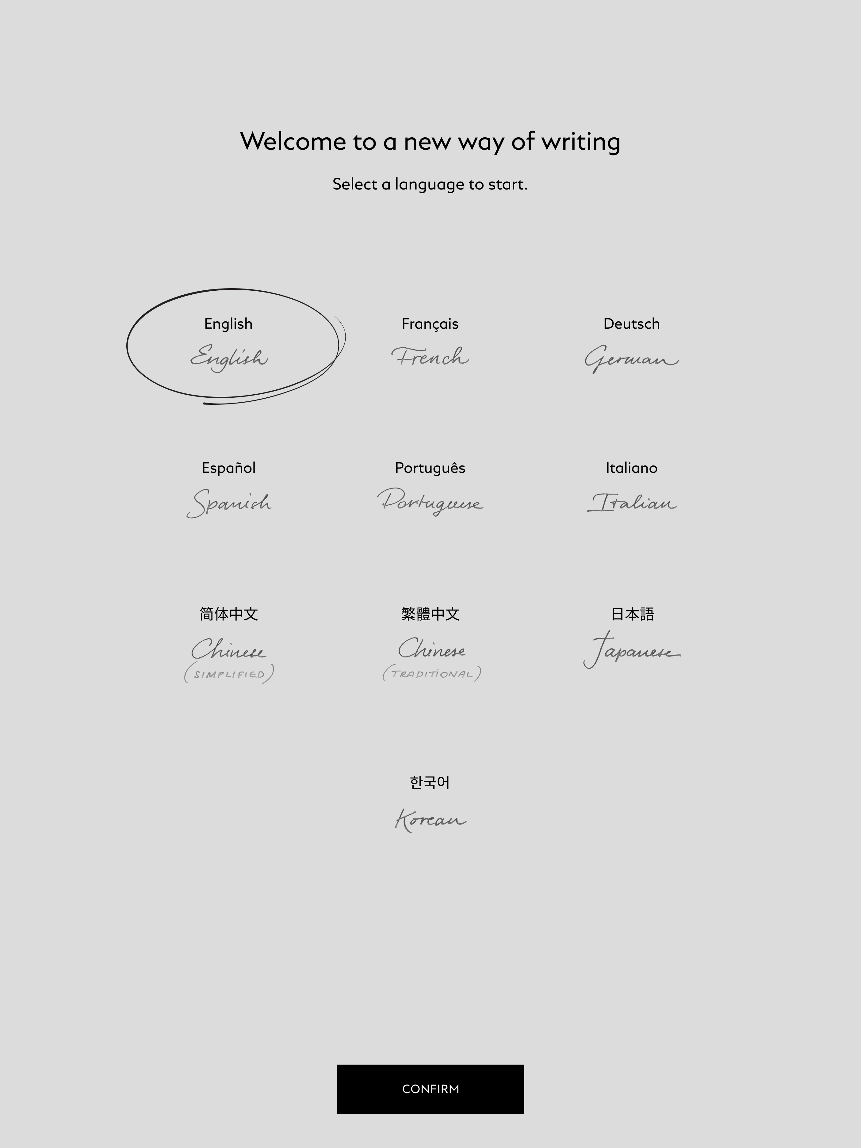
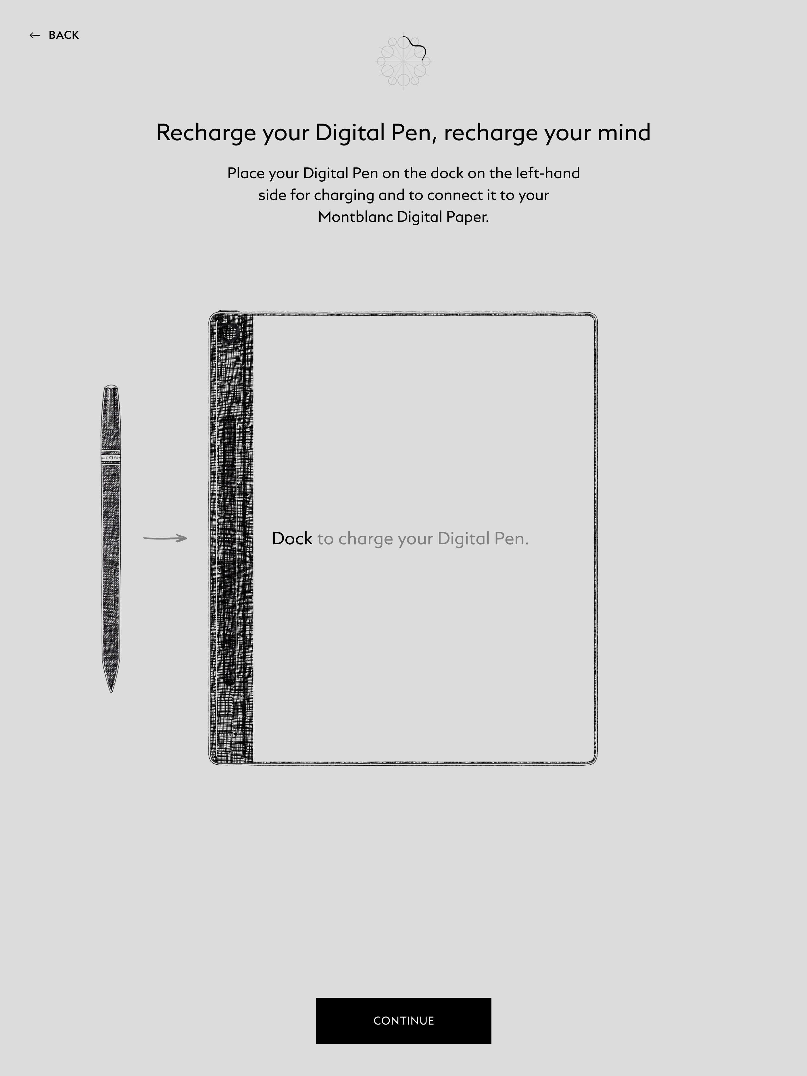
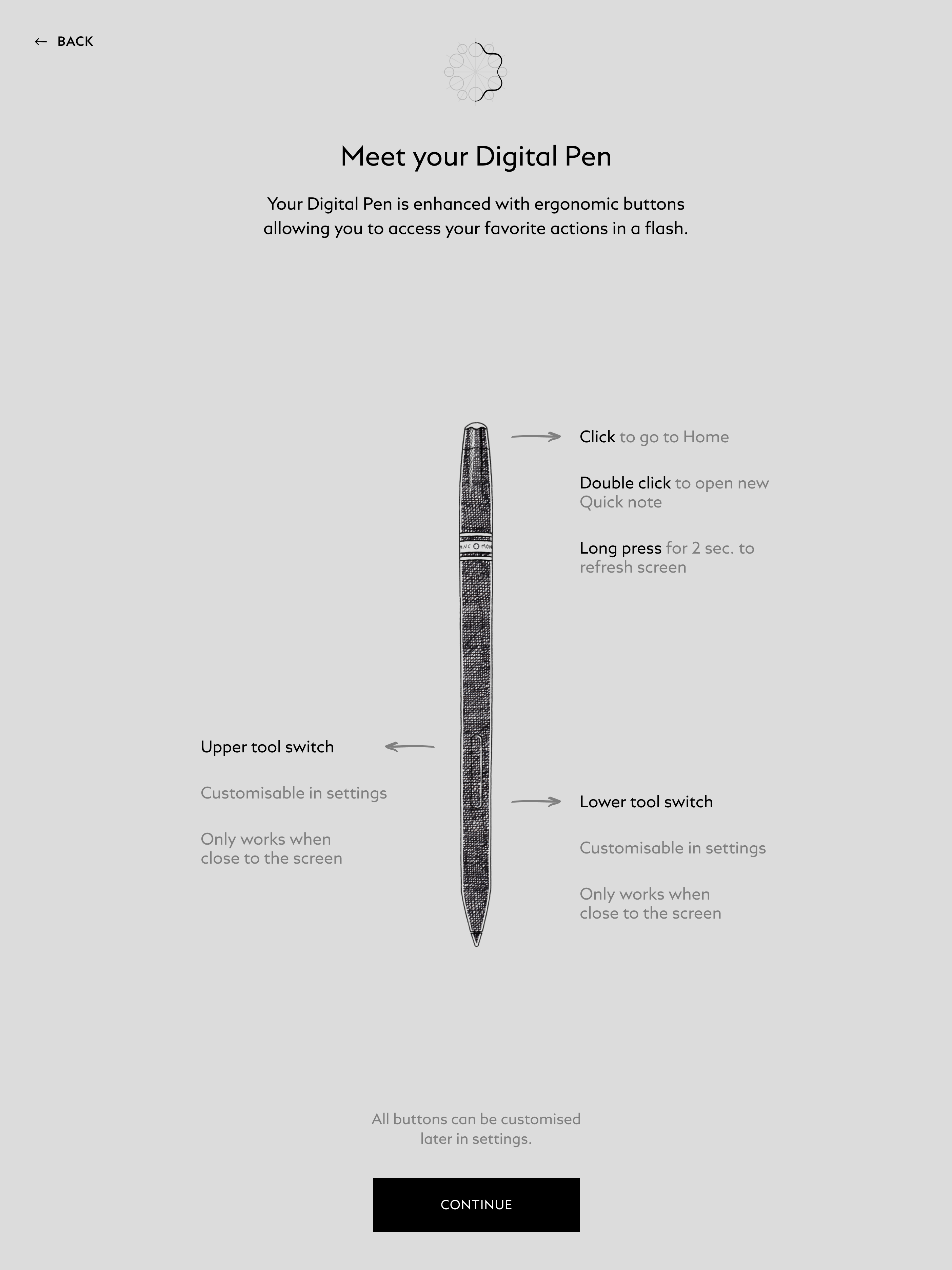
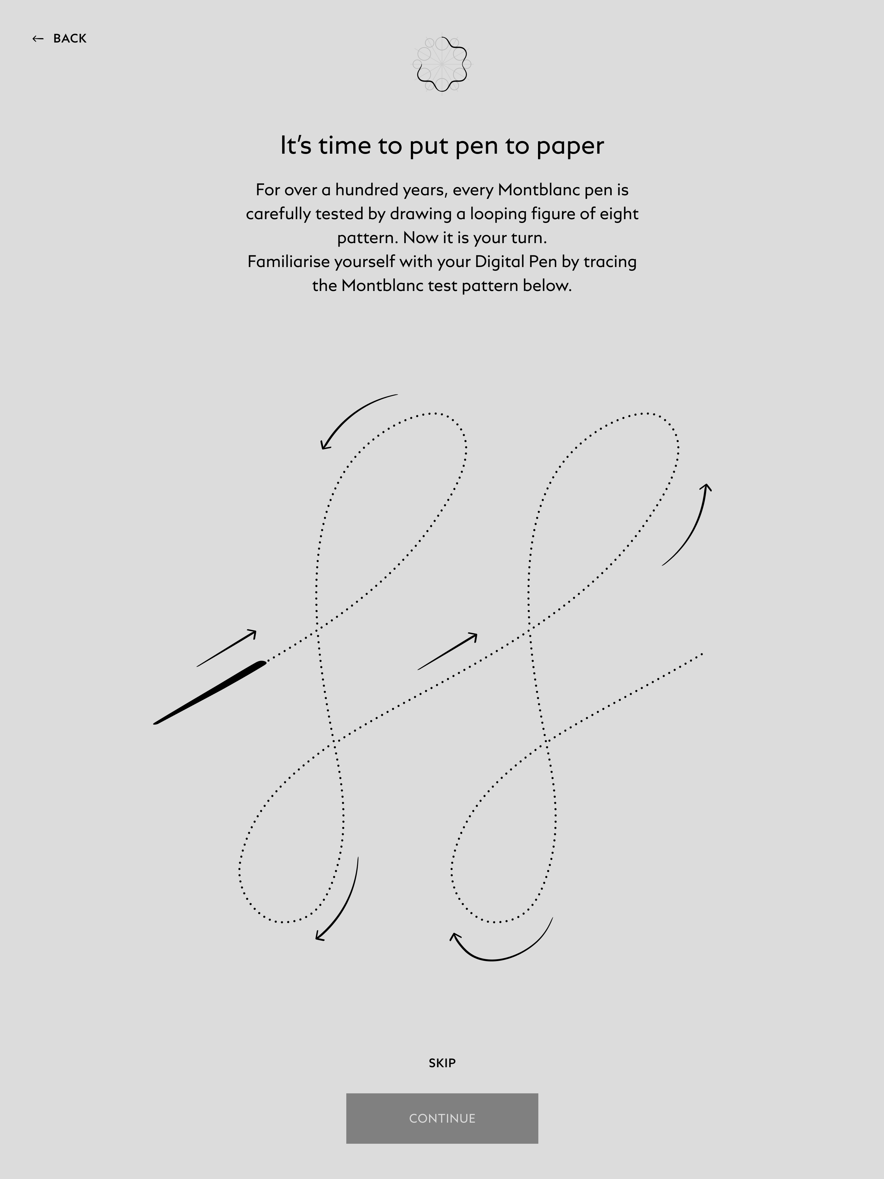
Onboarding Flow
The onboarding experience mixes Montblanc's storytelling with light, playful moments. Instead of overwhelming users, it gently walks them through the core features, from how the writing feels to small nods to Montblanc's craft, like nib-testing gestures and pressure-sensitive strokes.
After thorough testing around flow, timing, and clarity, the walkthrough became both easy to follow and familiar right from the start.
The Montblanc emblem acts as a progress indicator, revealing itself step by step, creating a sense of ownership and connection to the brand and device.
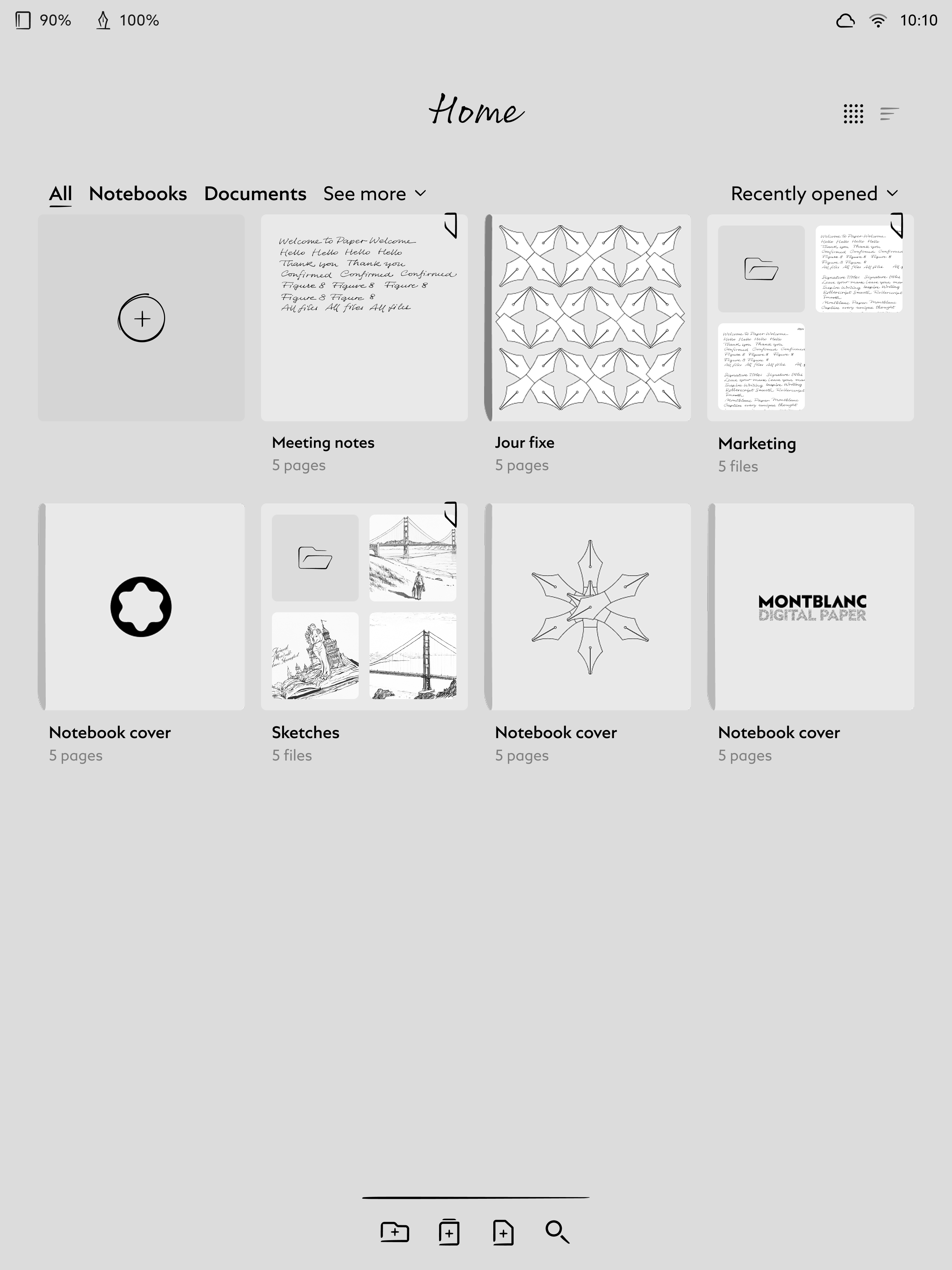
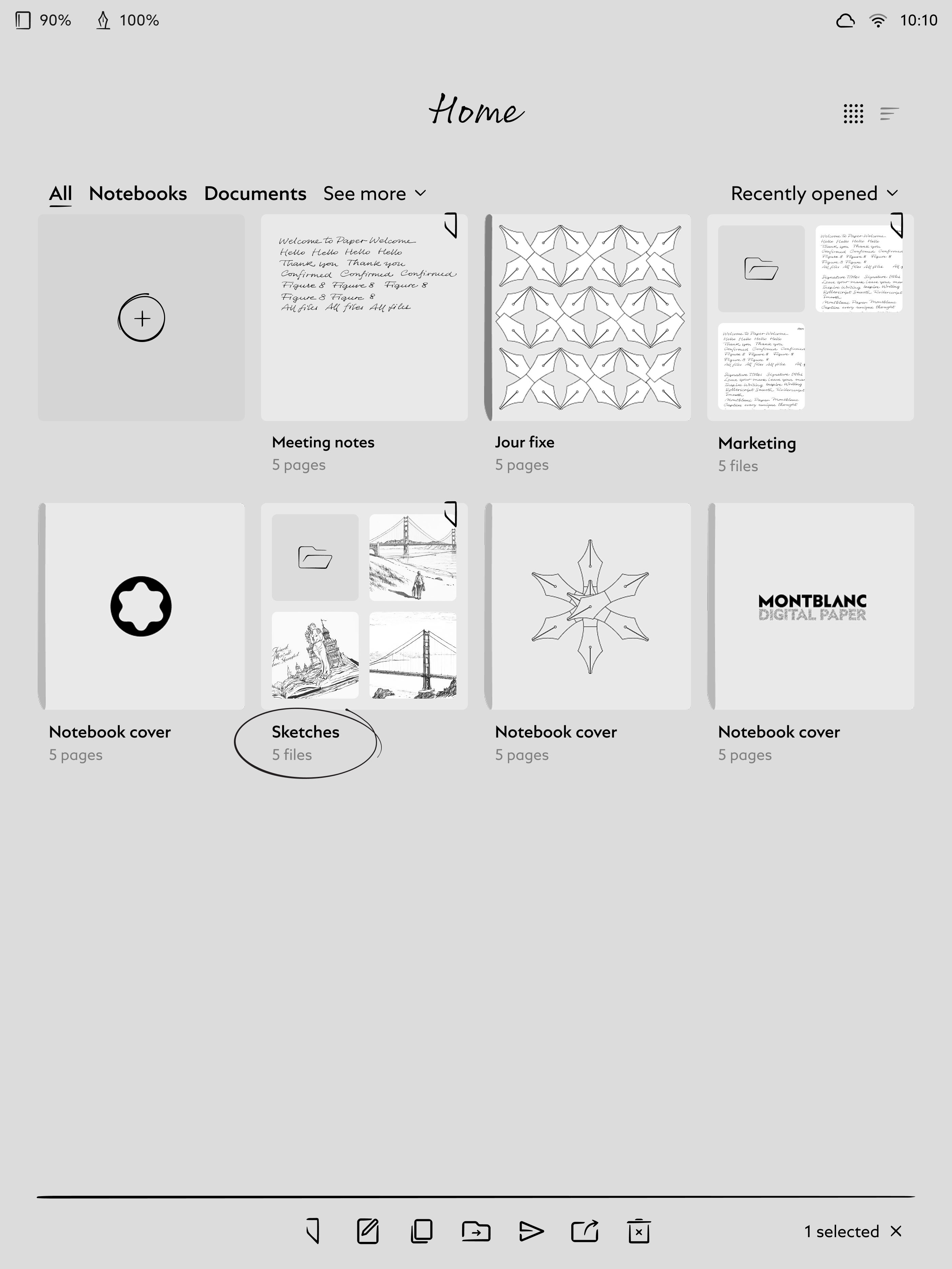
Home
The Home screen brings Montblanc's craftsmanship into a calm and minimal environment. Hand-drawn icons and fine linework add a subtle sense of tactility without distracting from the content. The layout stays open so notebooks, documents, and folders remain the clear focus.
A floating bottom toolbar provides the primary actions. When an item is selected, the toolbar intelligently shifts into contextual mode, revealing only the actions relevant to that selection. This approach keeps interactions simple and discoverable.
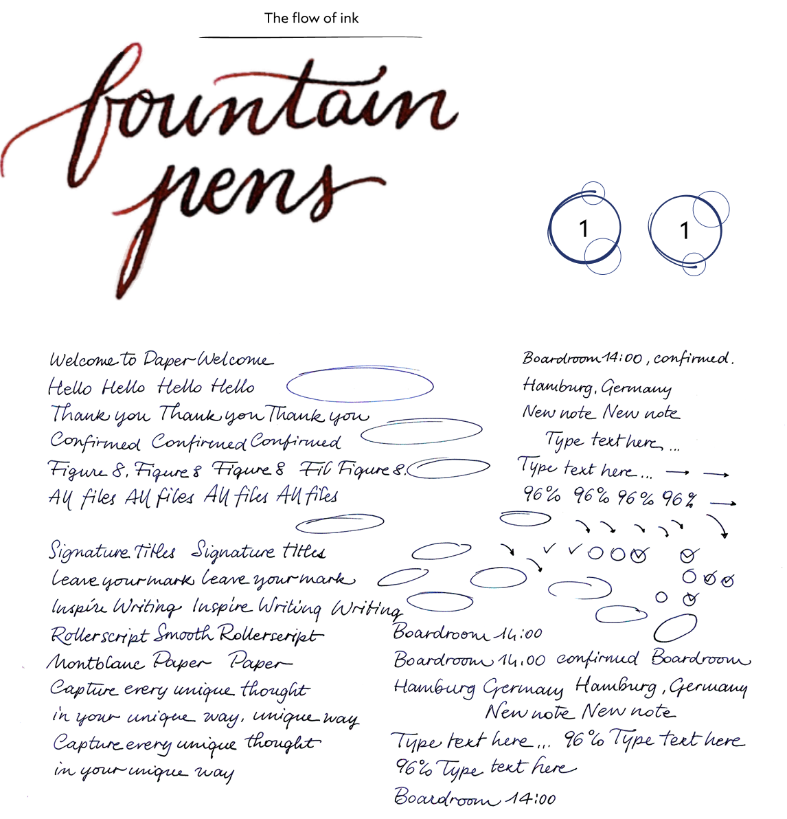
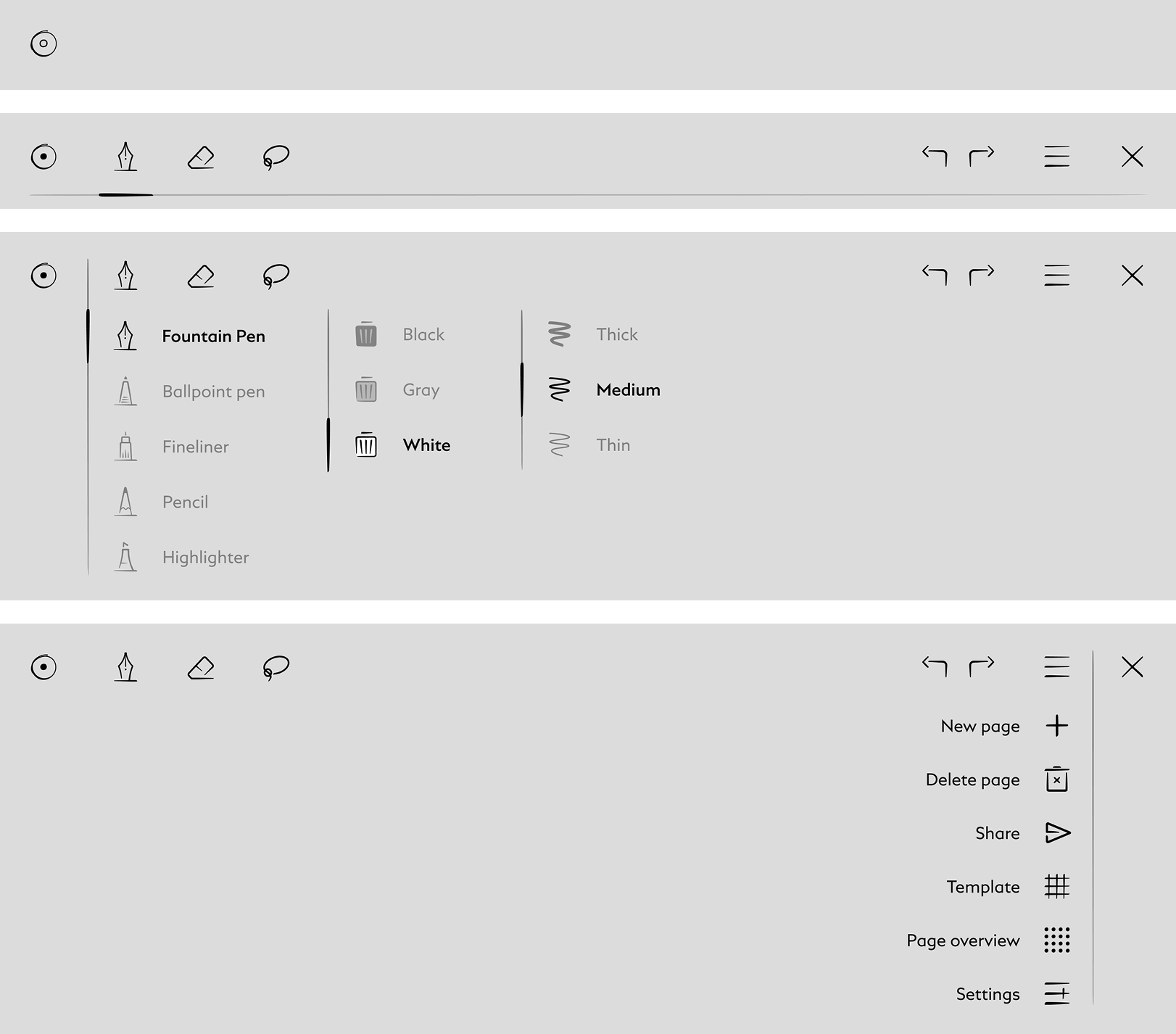
Writing
The writing environment is designed for full immersion. Tools remain hidden until needed, allowing the page to become the purest expression of digital handwriting.
A subtle brand reference lives in the toolbar icon, where the interaction echoes the twist mechanism of certain Montblanc pens, tying back to the physical rituals of writing:
Hollow dot = tools hidden
Filled dot = tools active
Impact
The result is a sleek, intuitive device that respects Montblanc's craftsmanship while embracing modern digital technology, setting a new benchmark in digital writing. Our close collaboration with the development team ensured the final product was as smooth and creative as our vision.