TOYOTA
Over the course of a year, I worked with Toyota and Lexus to streamline their digital navigation across 40+ European market websites.
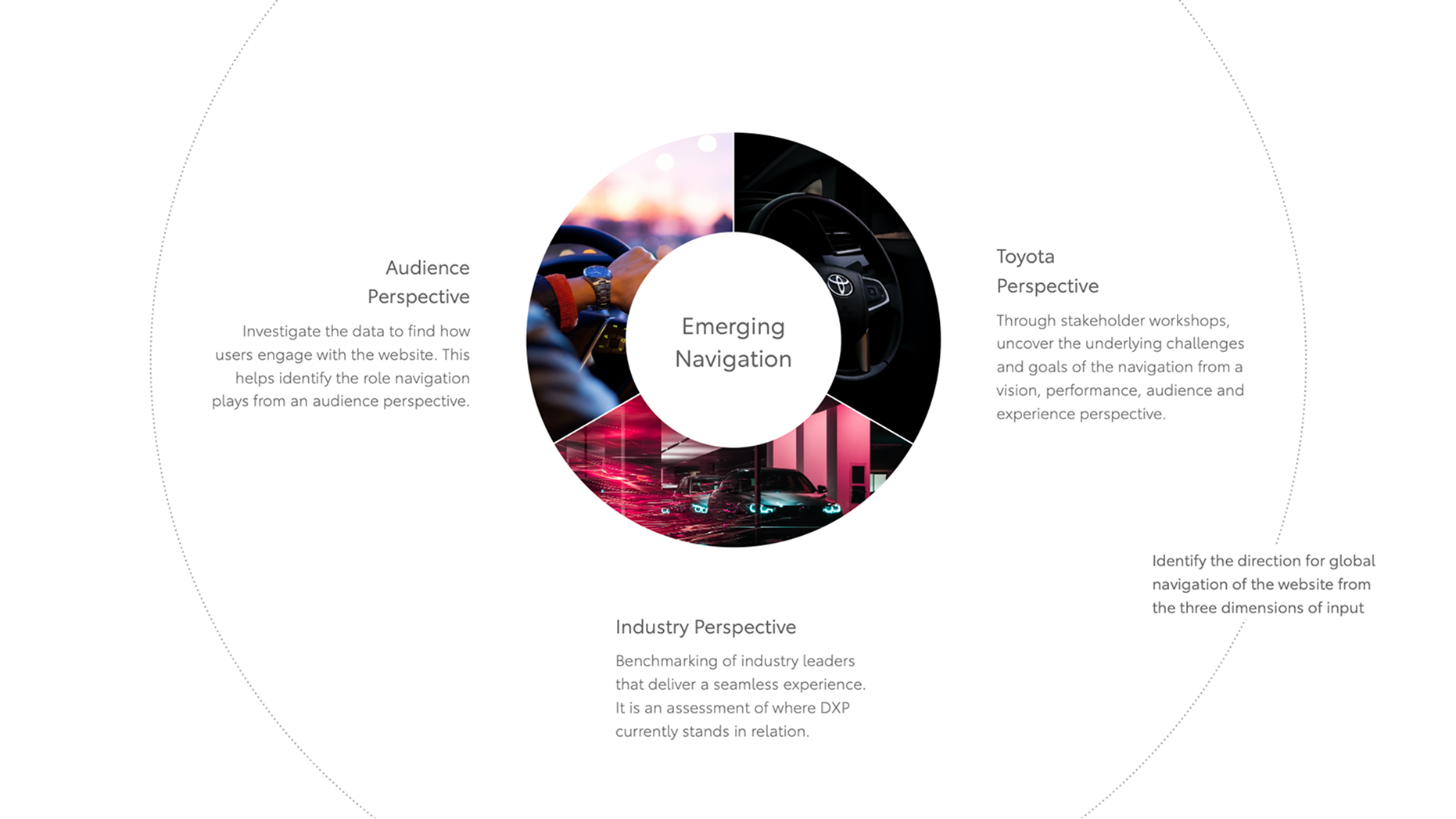
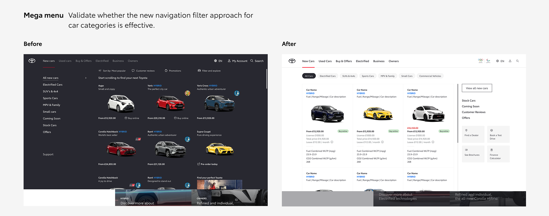
The challenge: design an elevated navigation system that addresses many market requirements and consumer needs, all while balancing discoverability and efficiency.
The ambition: To balance discoverability (the user's ability to find items) and efficiency (the user's ability to quickly find items without errors).
- Information Architecture
- Interaction Design
- User Research and Testing
- Cross-Market Strategy
- Accessibility and Usability
- 2022

A project based in deep research
Our research combined insights from Toyota's internal teams, industry best practices, and user needs to ensure a balanced solution that considered all perspectives.
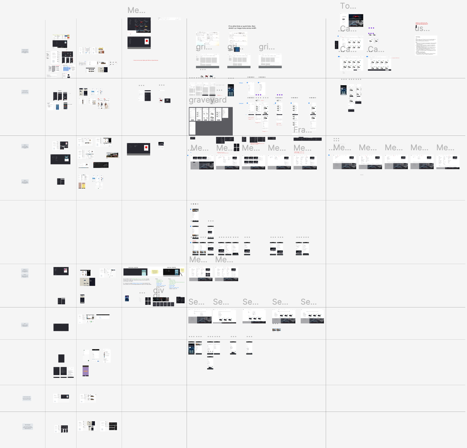
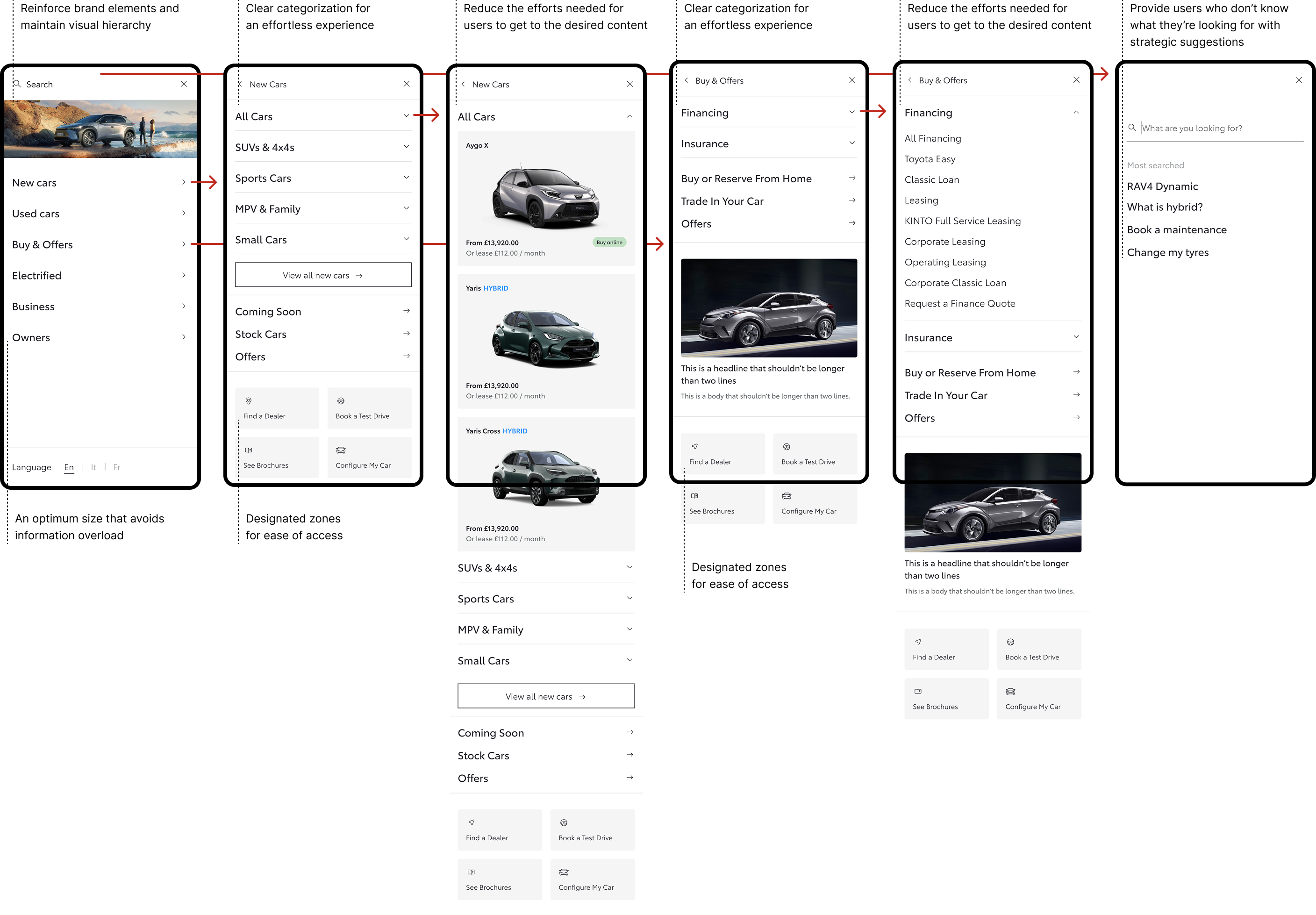
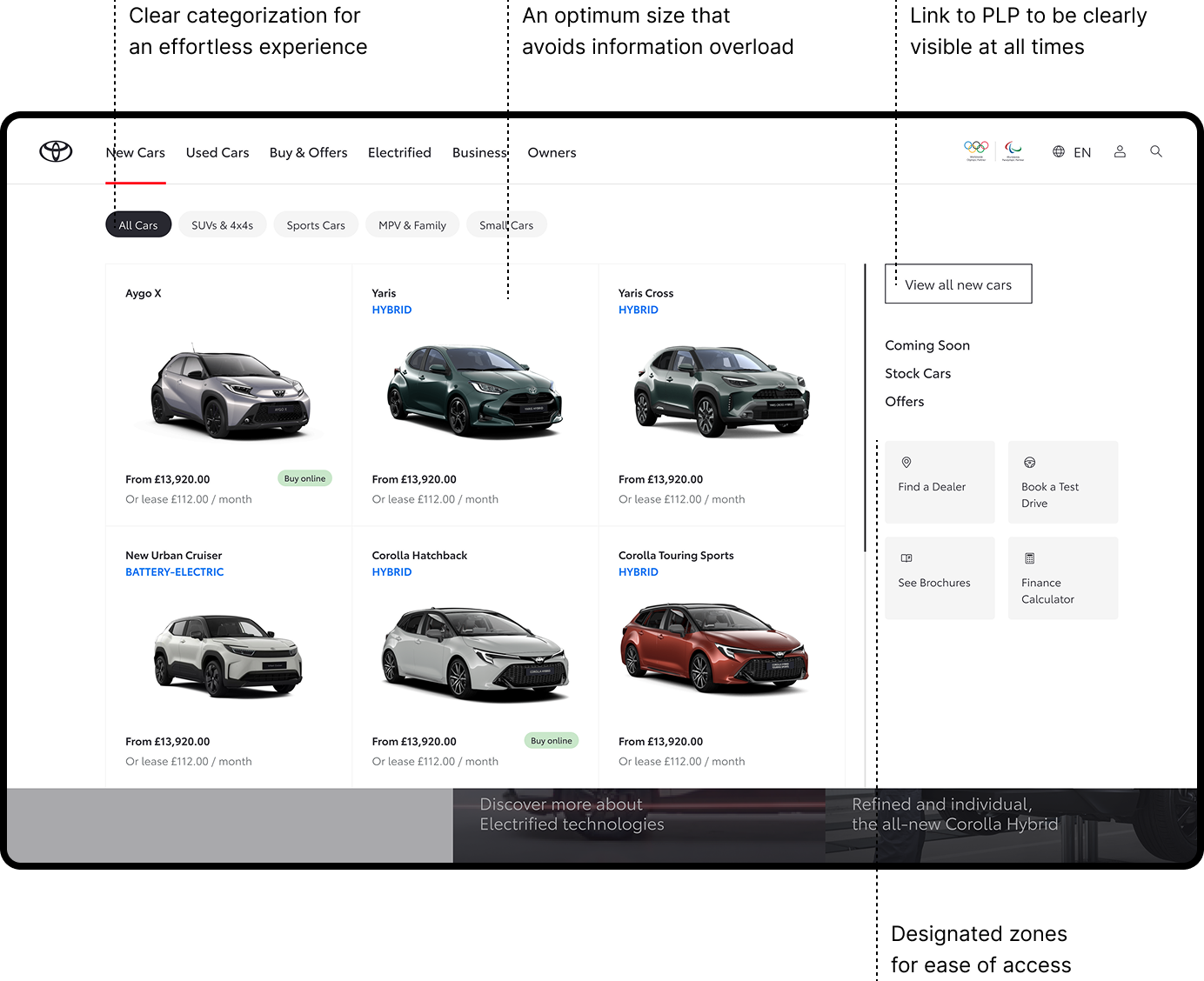
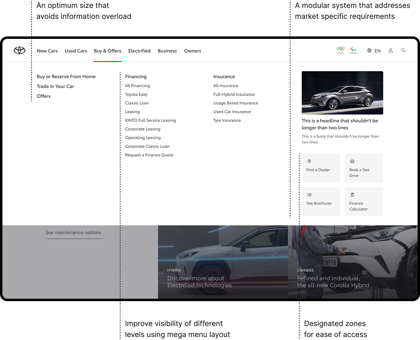
Our proposed approach to designing the navigation follows a top-down methodology, examining the broader system that requires improvement. This requires the redesign and testing of multiple components, resulting in a refreshed and cohesive navigation system.
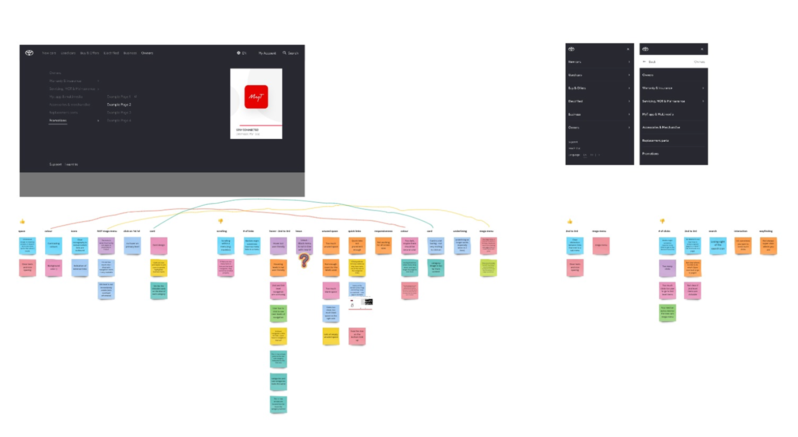
Workshop with key market stakeholders to align on goals, identify constraints, and uncover opportunities
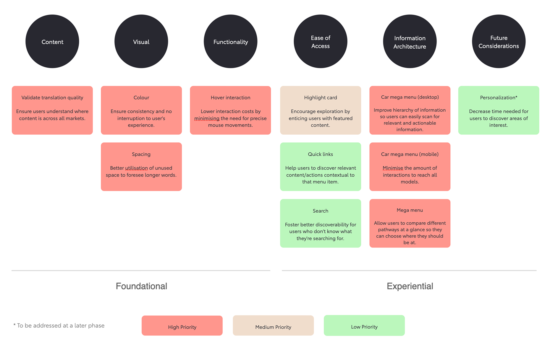
The RICE framework was used to prioritize workshop insights and define a clear roadmap
Reviewed 35+ best-in-class sites across industries
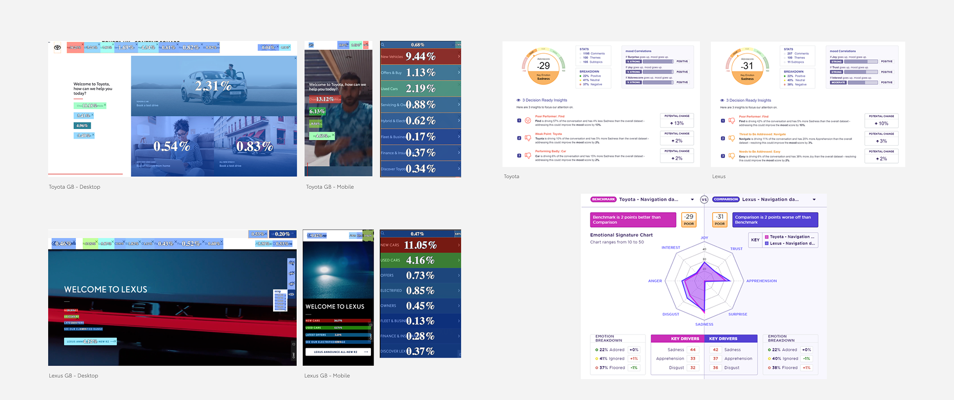
Partnered with a data provider to gather valuable consumer and qualitative insights.
Testing & Validation
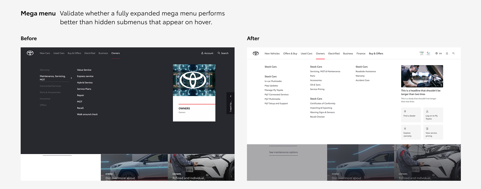
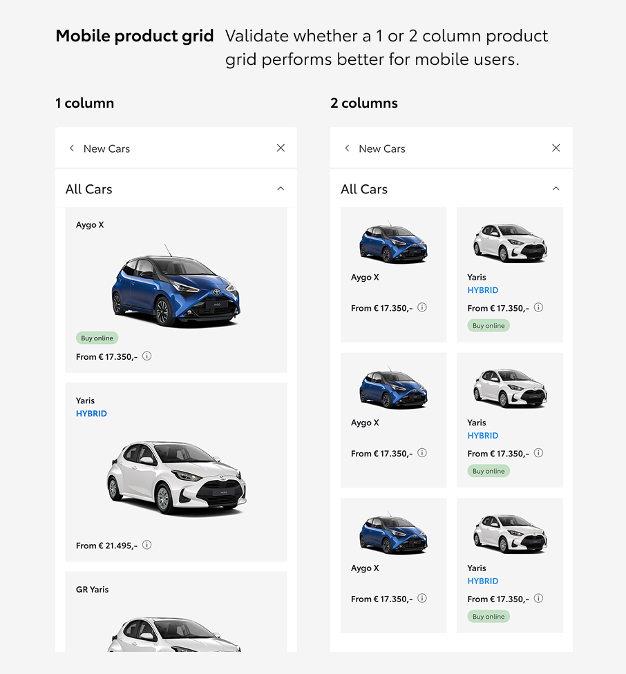
In the early design stages, we ran unmoderated online A/B tests with targeted participants to gather feedback on multiple directions and inform our design decisions.
We then validated the most significant updates on the live sites, comparing the existing navigation with the redesigned version and running A/B tests on variations that had mixed results in the earlier tests. This allowed us to observe real user behavior and gather more definitive insights before finalizing the changes.
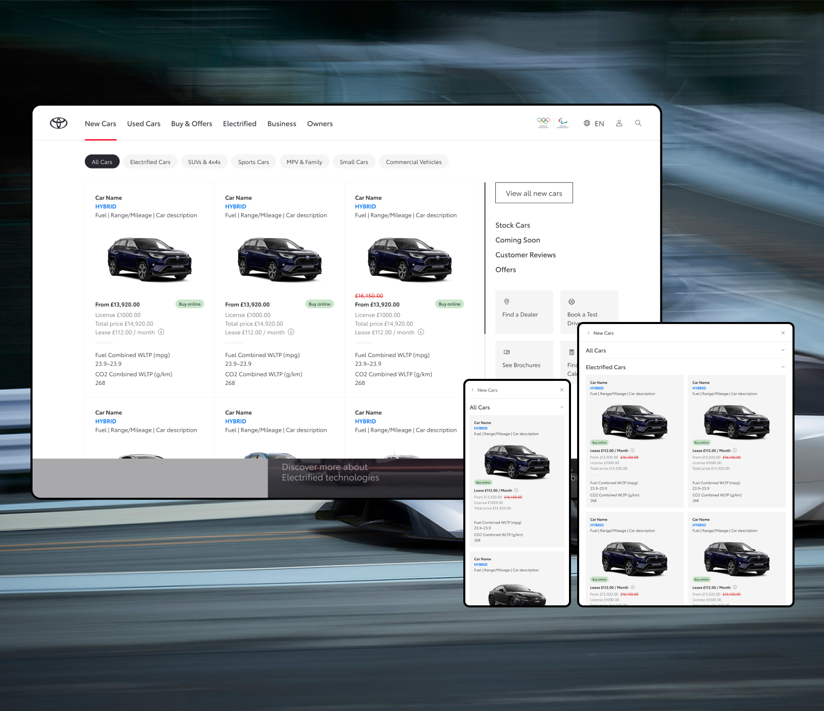
Final Designs: Toyota
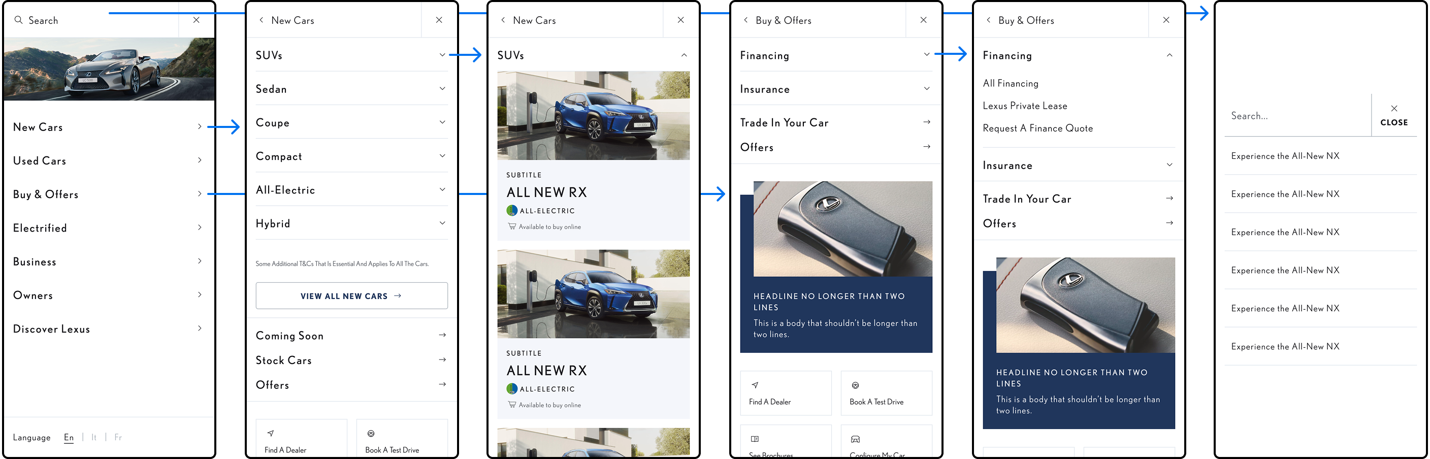
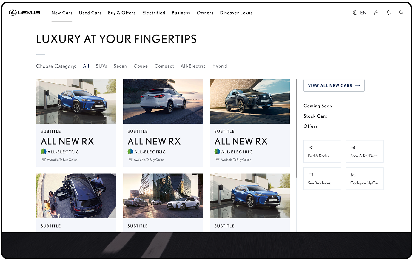
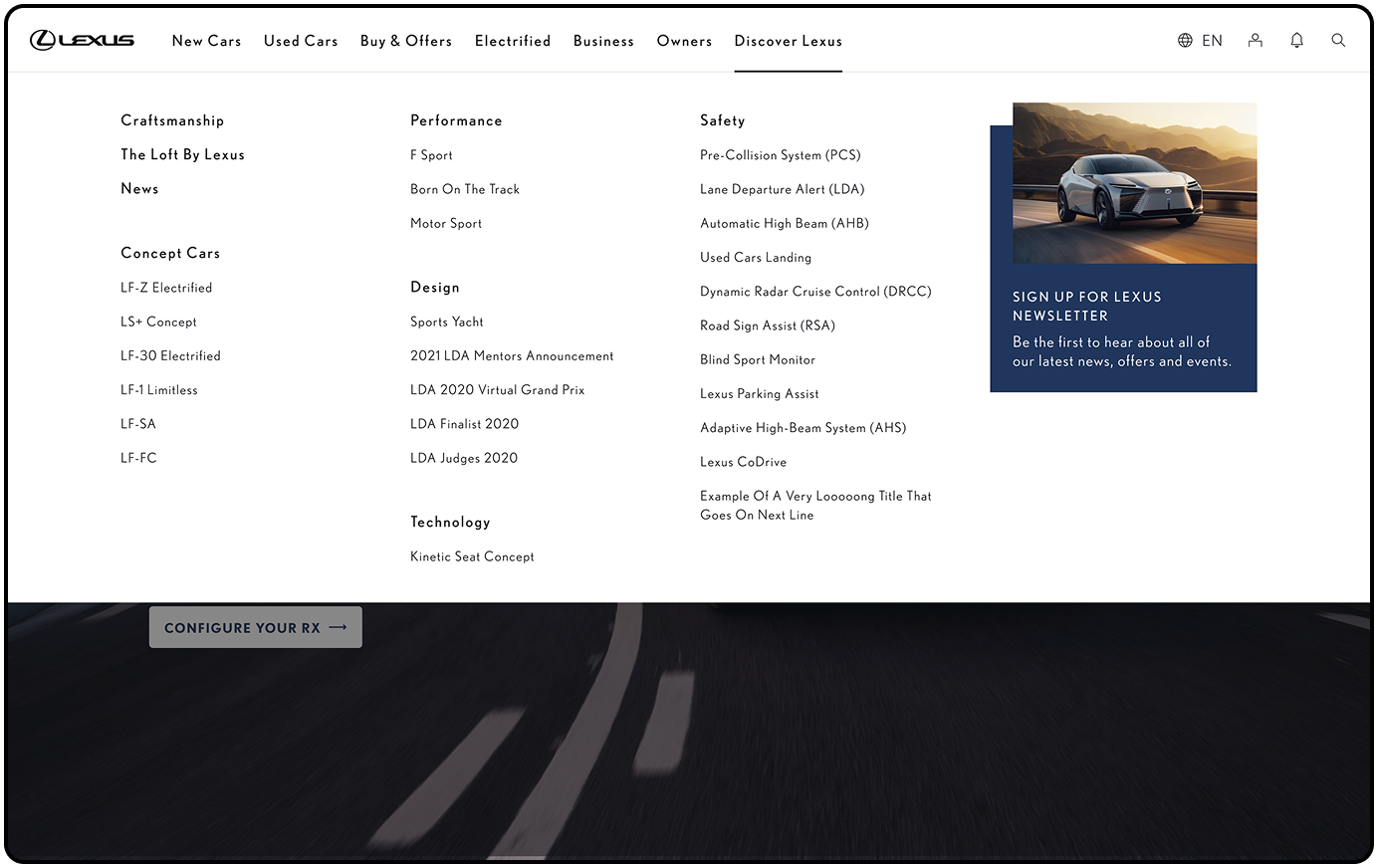
Final Designs: Lexus
We adapted the solution for Lexus, keeping the core structure and information architecture consistent while refining the visual language and tone to reflect their premium experience.
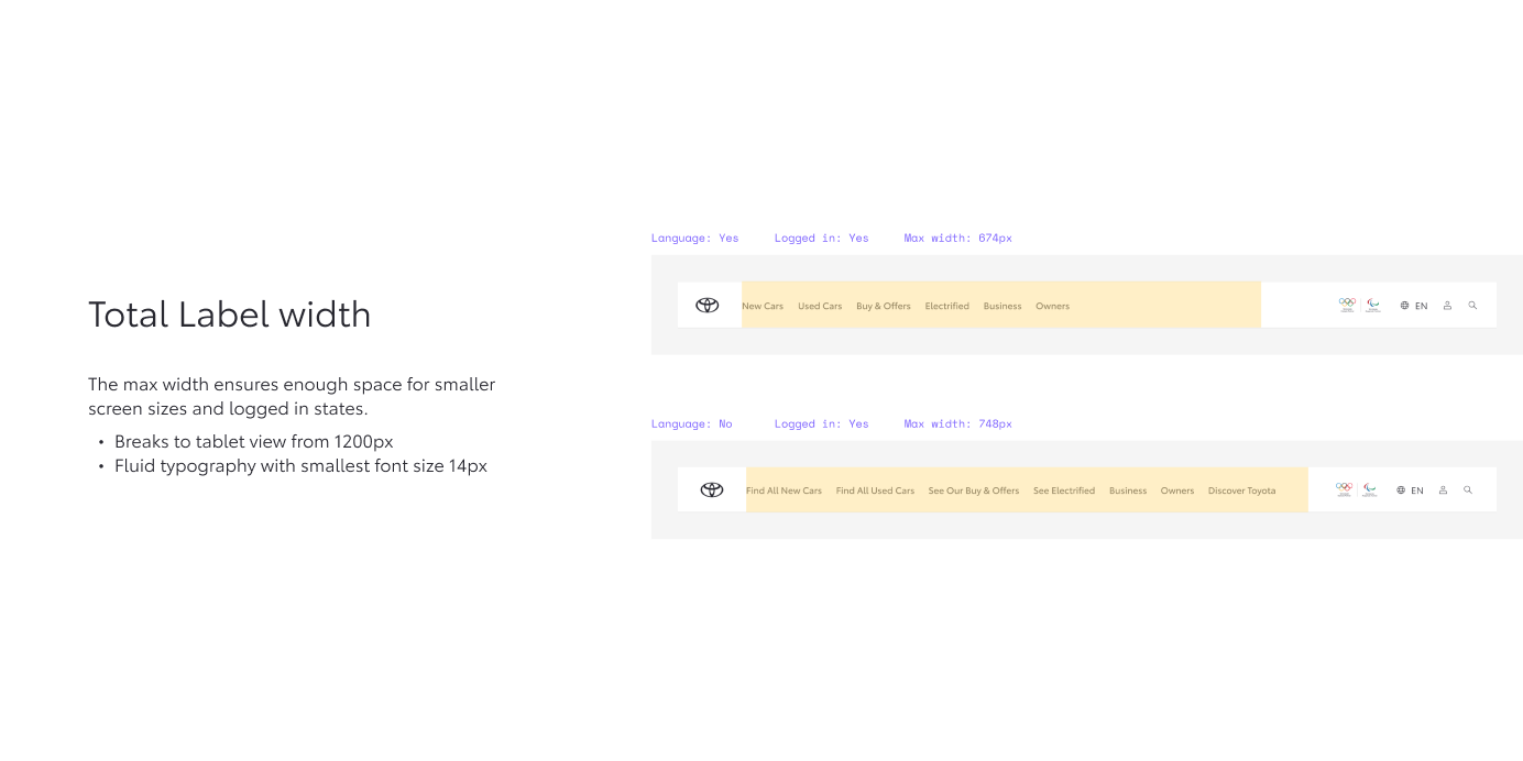
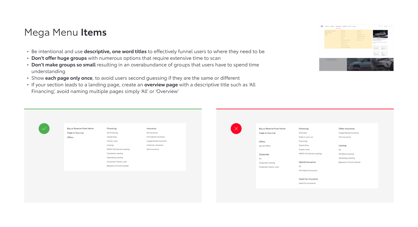
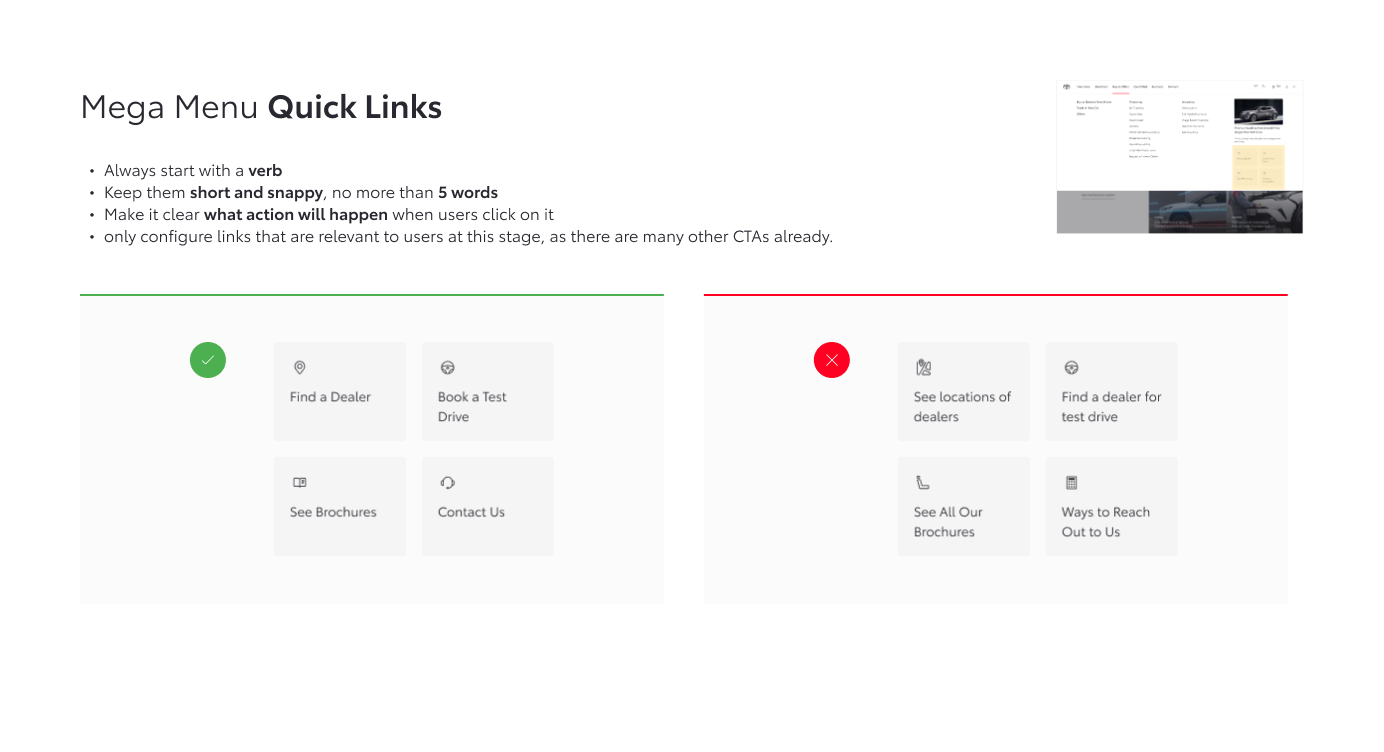
Content Guidelines
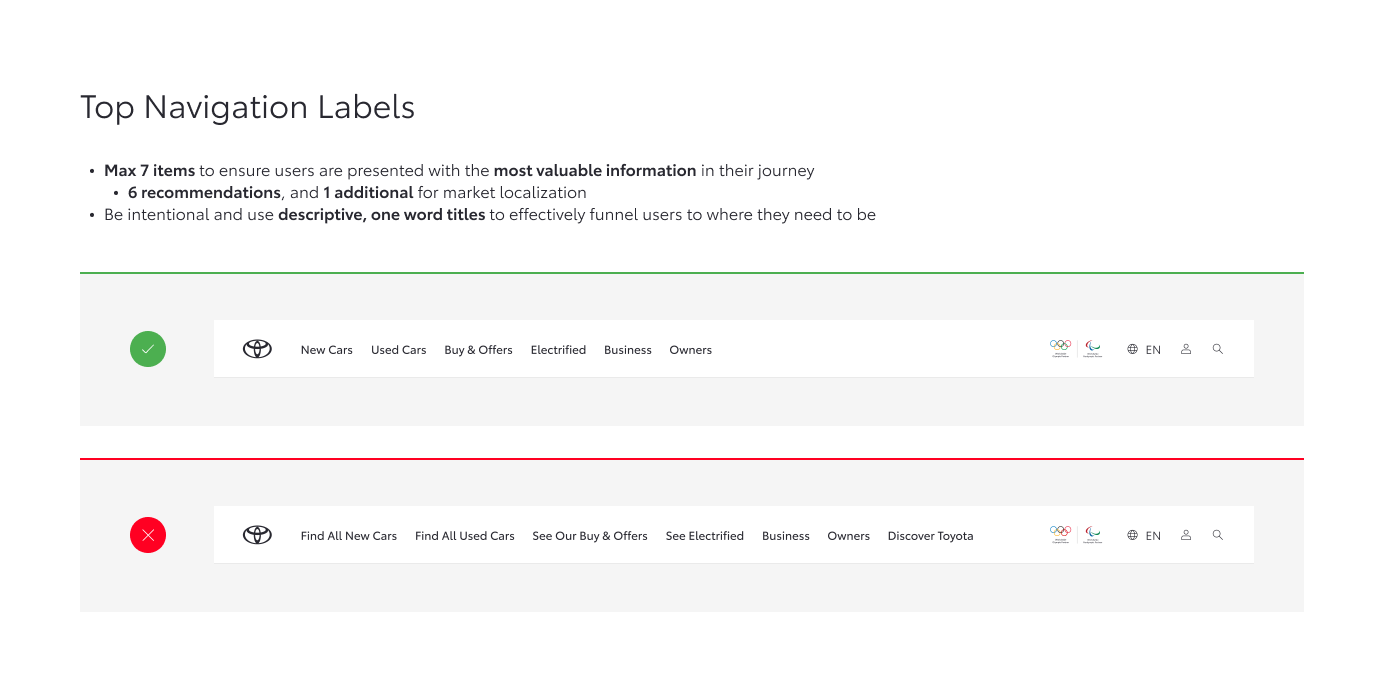
To ensure clarity and consistency across markets, we developed a set of navigation content guidelines. These covered tone of voice, labeling conventions, and hierarchy principles, ensuring users can quickly understand and interact with the navigation regardless of language or region.
Reflection
This was a significant change, requiring open communication with all markets, careful consideration of localization and language constraints, and ongoing feedback. It also involved close collaboration and regular check-ins with the development team to review all design details and ensure their implementation matched the intended design. The result is a solution that is flexible yet remains true to the core strategy and information architecture.